

Chart Mission 6 – Understanding Timeframes

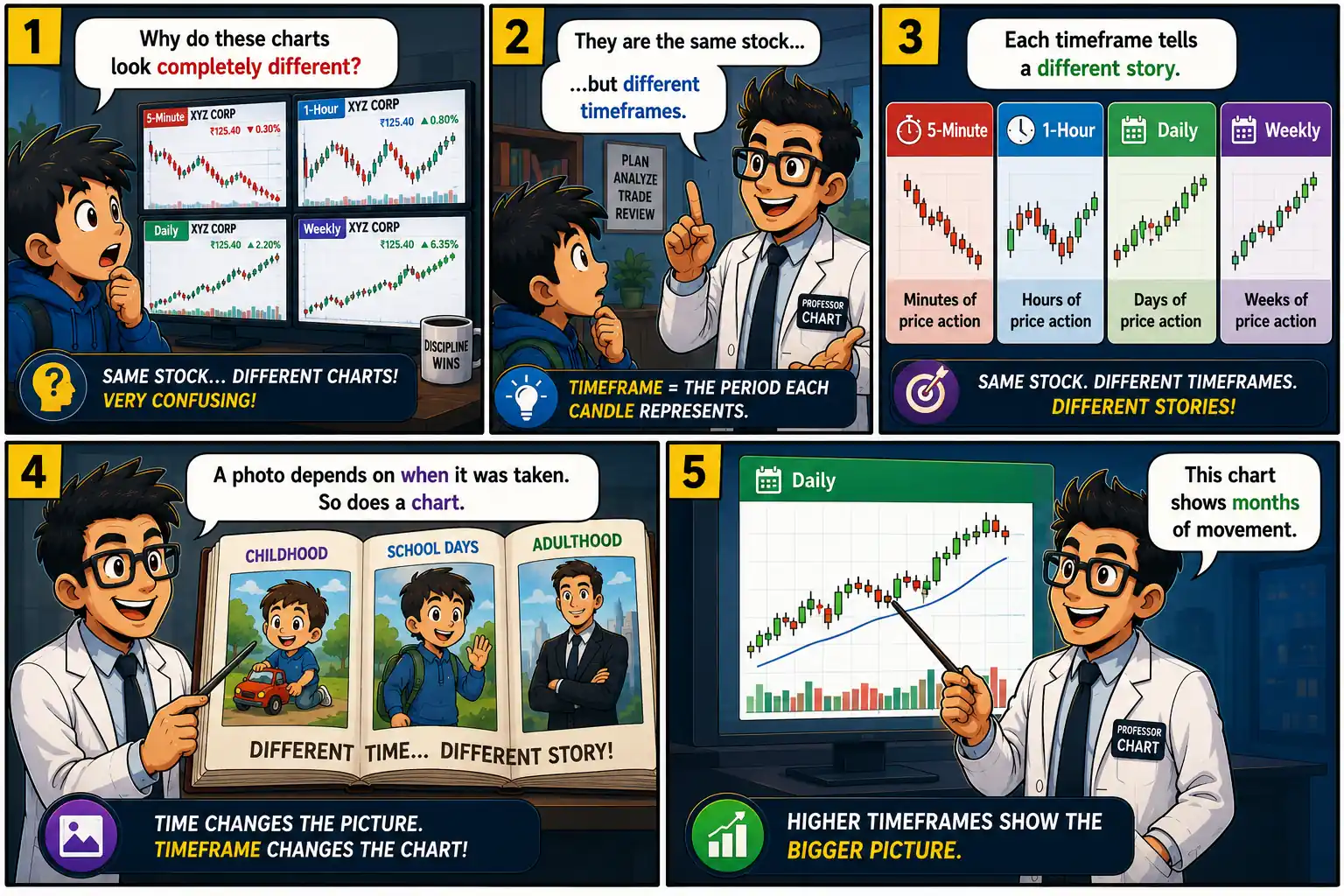
Chart Mission 6 hero image explaining stock market timeframes with Professor Chart, Bull, Bear, and students comparing 5-minute, 1-hour, daily, and weekly stock charts.

Introduction

Arjun was excited.

He had finally learned candlesticks.

But something strange happened.

The same stock looked bullish on one chart…

Bearish on another…

And completely flat on a third!

He rushed to Professor Chart.

“Which chart is correct?”

Professor smiled.

“Every one of them.”

Arjun blinked.

“What?”

Professor opened the Time Portal.

“Today’s mission is about understanding timeframes.”

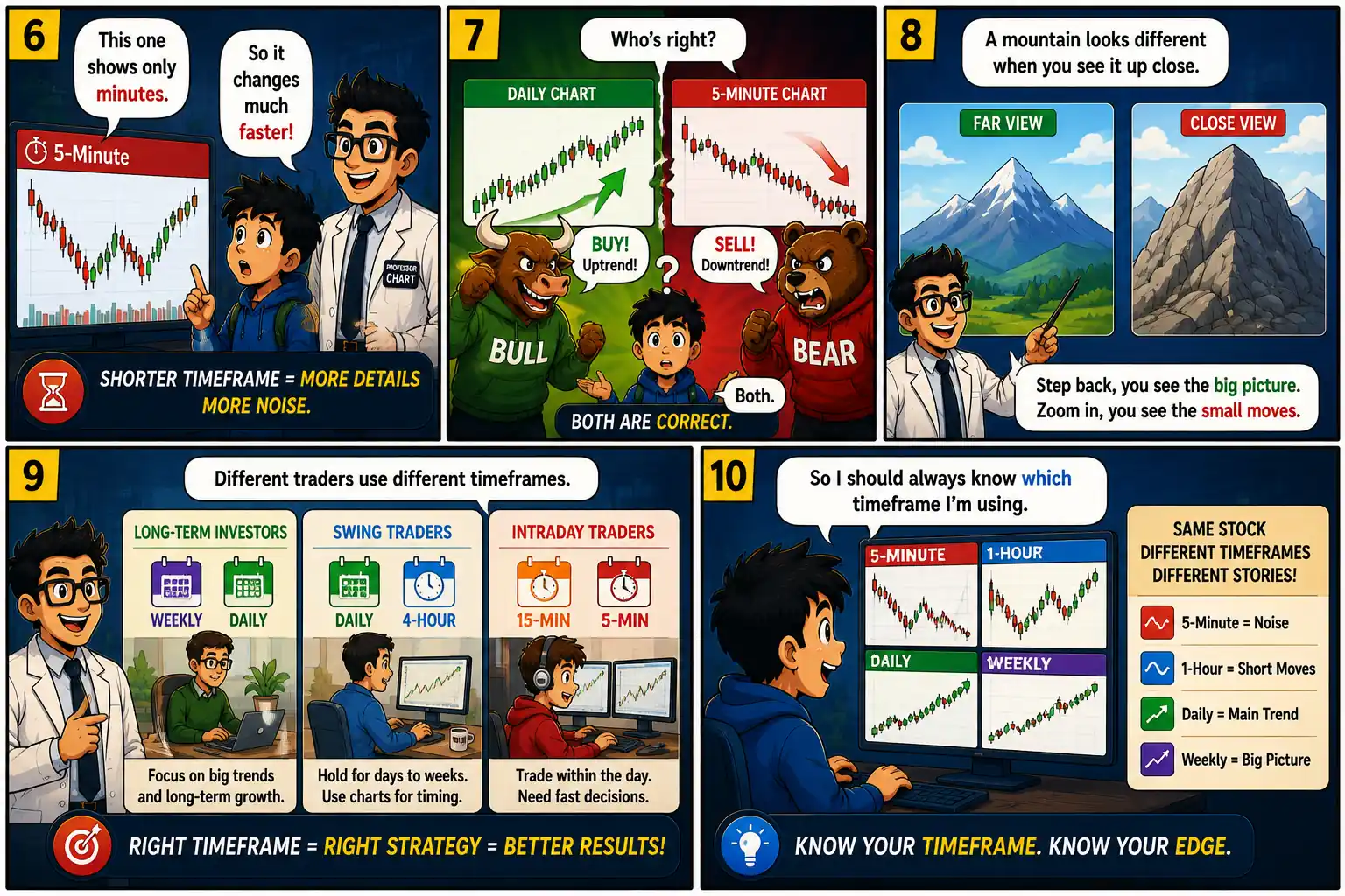
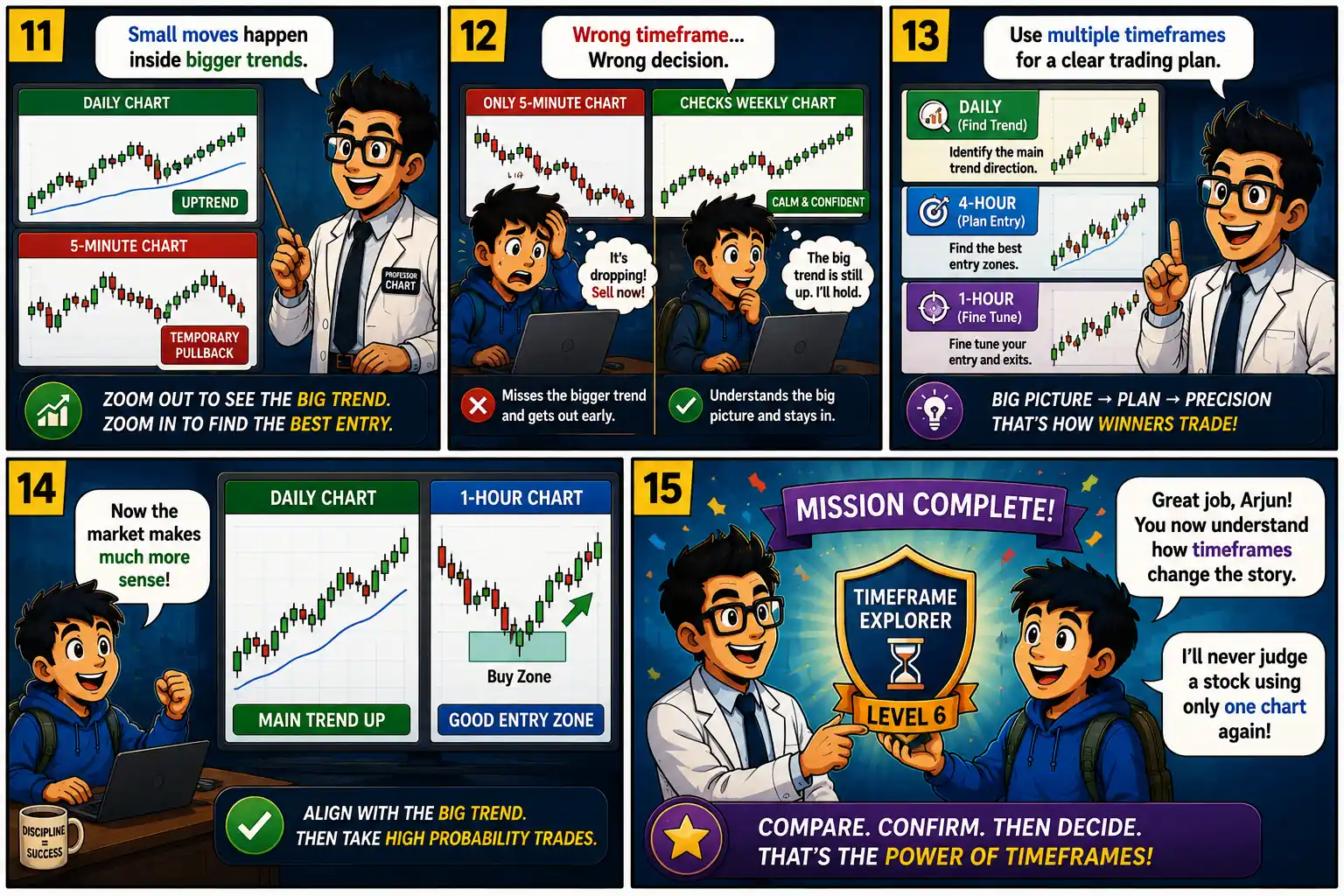
Chart Mission 6 comic panels 1 to 5 introducing stock chart timeframes, explaining why the same stock looks different across 5-minute, 1-hour, daily, and weekly charts. Chart Mission 6 comic panels 6 to 10 explaining short-term versus long-term charts, multiple timeframe analysis, trading styles, and choosing the correct timeframe for better decisions. Chart Mission 6 comic panels 11 to 15 showing multiple timeframe analysis, avoiding wrong trading decisions, planning entries, and earning the Timeframe Explorer Level 6 badge.

What We Learned

A timeframe determines how much market activity each candle represents. A 5-minute chart shows one candle for every five minutes, while a daily chart shows one candle for an entire trading day. Because each timeframe summarizes different amounts of data, the same stock can appear bullish on one chart and bearish on another.

Shorter timeframes reveal small price fluctuations and are often used by intraday traders. Longer timeframes smooth out market noise and help investors identify the broader trend. Neither is “right” or “wrong”—they simply answer different questions.

Successful traders often use multiple timeframes. They identify the main trend on higher timeframes (such as the daily or weekly chart) and then use lower timeframes (such as the 1-hour or 15-minute chart) to refine their entry and exit decisions.

Understanding timeframes helps reduce confusion, avoid emotional decisions, and align trades with the bigger market picture.

Key Takeaways

  • ⏱️ Every chart timeframe tells a different story.
  • 📈 Higher timeframes show the bigger trend.
  • 📉 Lower timeframes show short-term price movements.
  • 🔍 The same stock can look different across charts.
  • 🎯 Use multiple timeframes before making trading decisions.
  • 🧠 Always know which timeframe you are analyzing.

Vocabulary

Timeframe – The period represented by each candle on a chart.

Intraday Chart – A chart showing price movement within a single trading day.

Daily Chart – One candle represents one trading day.

Weekly Chart – One candle represents one week.

Multiple Timeframe Analysis – Comparing different timeframes to make better trading decisions.

Smart Investor Tip 

The trend on a higher timeframe is often stronger than the noise on a lower timeframe. Always zoom out before making a trading decision.

Next Chart Mission Preview

Chart Mission 7: Market Sessions

Have you ever noticed that the stock market behaves differently at the opening bell, during the afternoon, and just before the market closes? In Chart Mission 7 – Market Sessions, Professor Chart takes Arjun inside the trading day to uncover why price movements and trading volume change throughout each session. Discover how market openings create excitement, why midday often slows down, and how the closing session can reveal important clues about institutional buying and selling. Get ready to learn when the market is most active, when to stay patient, and how understanding market sessions can help you make smarter trading decisions.

Scroll to Top