Chart Mission 3 – Candlestick vs Line Chart

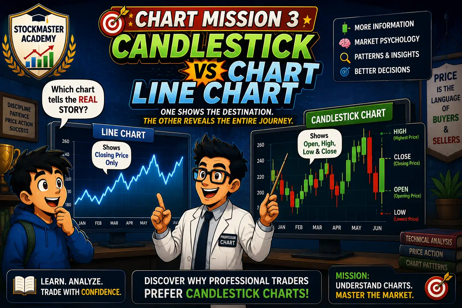
Chart Mission 3 hero image comparing candlestick charts and line charts with Professor Chart teaching Arjun why professional traders prefer candlestick charts.

Introduction

Arjun had learned that price tells a story, but another mystery awaited him inside the grand hall of Chart Academy.

Two enormous screens stood side by side.

The first displayed a smooth blue line moving up and down. It looked simple and easy to understand.

The second screen was completely different. It was filled with green and red candlesticks of different sizes, each with tiny lines extending above and below.

Arjun scratched his head.

“Professor Chart,” he asked, “both charts show the same stock. Why does everyone keep talking about candlestick charts?”

Professor Chart smiled.

“Excellent question.”

He waved his pointer.

The blue line chart glowed.

“It tells you only one thing—the closing price.”

Then the candlestick chart came alive.

Each candle transformed into a tiny battlefield. Green candles celebrated buying victories. Red candles showed sellers taking control. Long shadows revealed moments of panic, excitement, and uncertainty.

Professor Chart continued,

“Imagine reading a football match by seeing only the final score.”

Arjun nodded.

“You would know who won…”

“…but not how the match was played.”

“Exactly.”

“The line chart is the final score.”

“The candlestick chart is the entire match.”

Arjun suddenly realized why professional traders preferred candlesticks.

Every candle contained much more information than a simple line.

Open.

High.

Low.

Close.

Four prices instead of one.

Professor Chart smiled.

“When traders want a quick overview, they use line charts.”

“But when they want to understand buyer and seller psychology…”

“…they read candlesticks.”

Mission Three had begun.

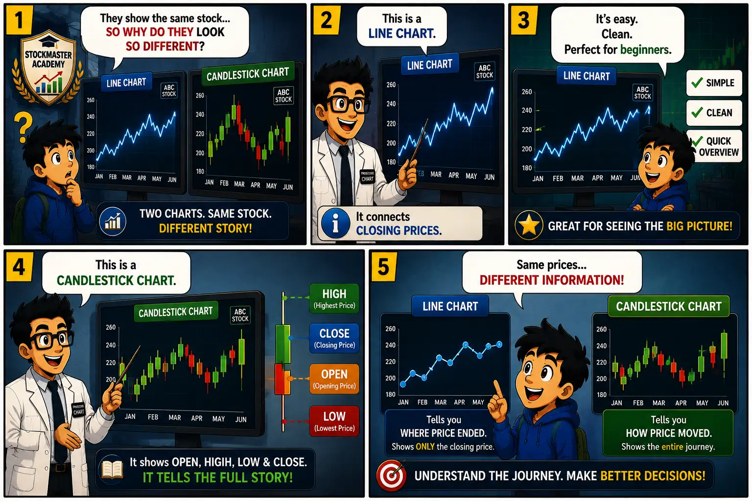
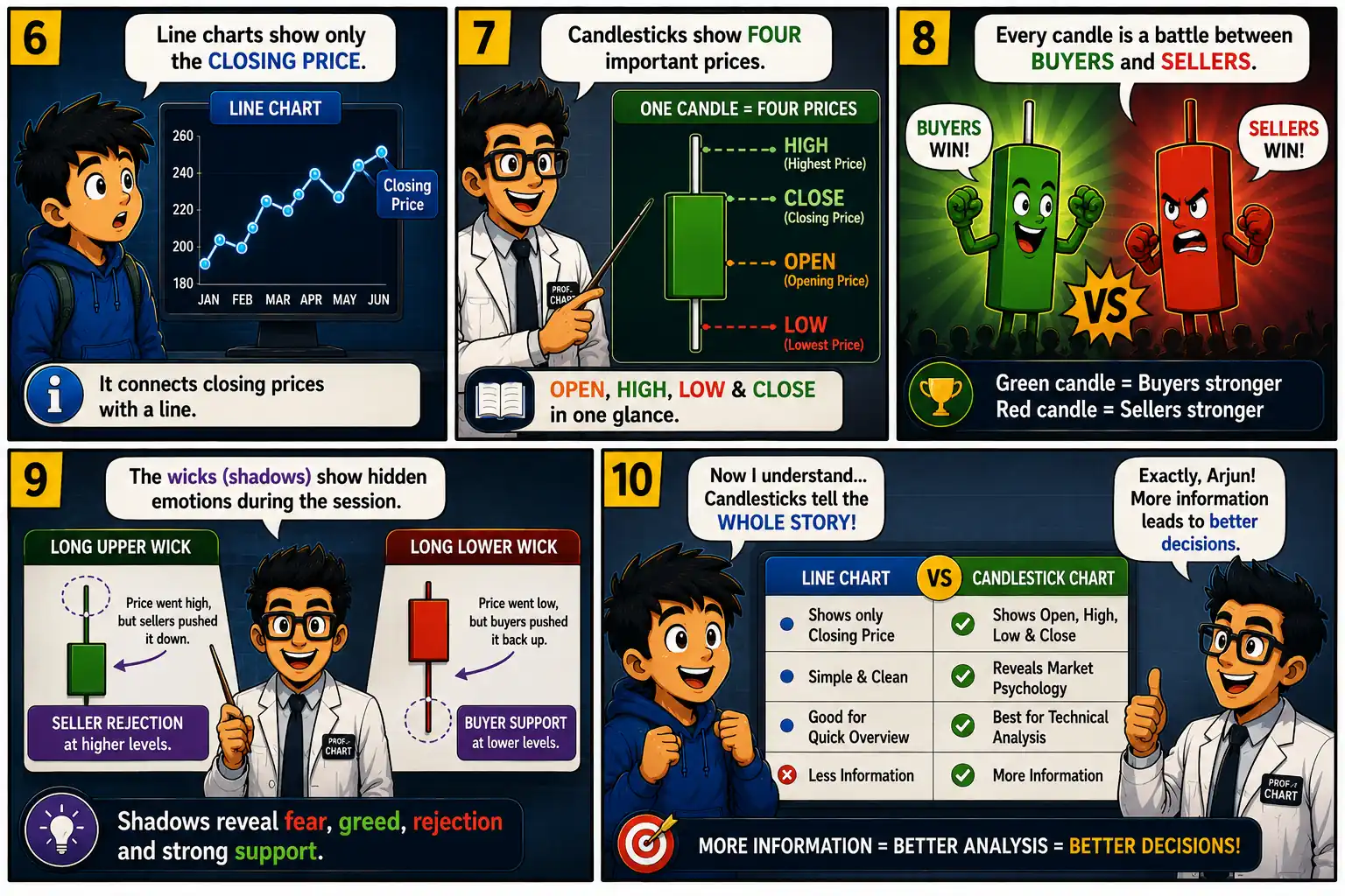
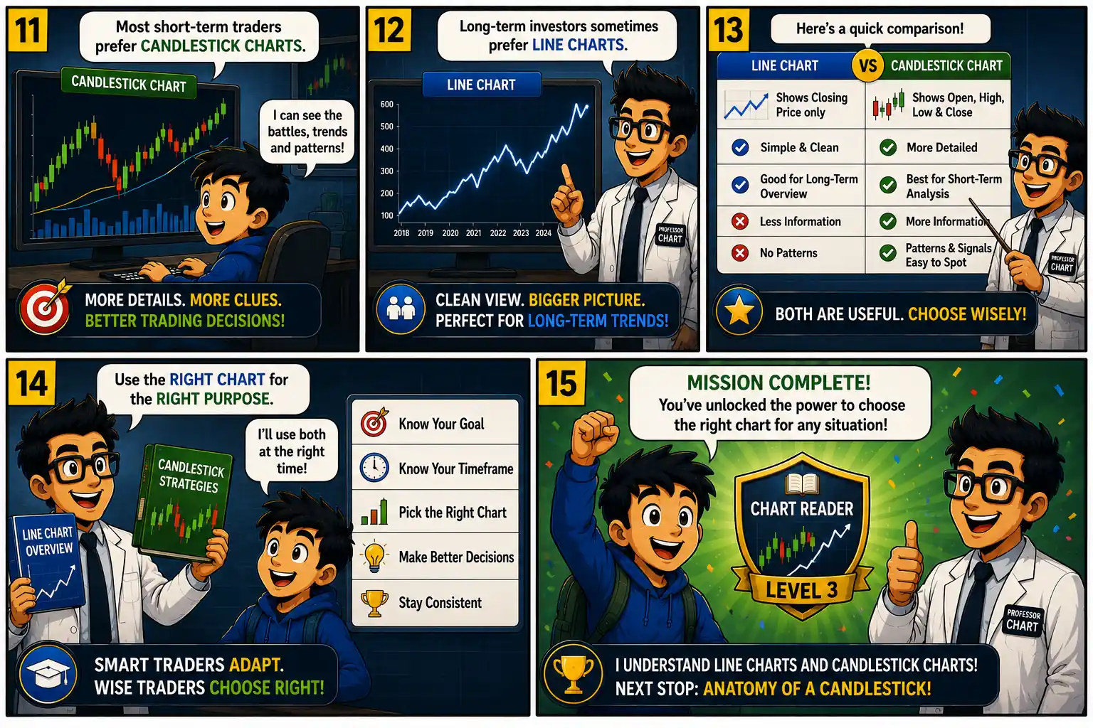
Chart Mission 3 comic panels 1 to 5 introducing line charts and candlestick charts, explaining how each chart displays stock price information differently. Chart Mission 3 comic panels 6 to 10 explaining closing prices, OHLC data, buyer and seller psychology, candlestick wicks, and why candlestick charts reveal more information. Chart Mission 3 comic panels 11 to 15 comparing candlestick charts and line charts, showing when to use each chart and awarding the Chart Reader Level 3 badge.

What We Learned

Both line charts and candlestick charts display the price movement of a stock, but they present information in different ways and serve different purposes.

A line chart is the simplest type of price chart. It is usually created by connecting the closing price of each trading session with a continuous line. Because it focuses only on closing prices, the chart is clean, easy to read, and ideal for beginners or long-term investors who want a quick overview of a stock’s direction. If your goal is simply to see whether a stock has generally moved up or down over time, a line chart is often enough.

A candlestick chart, however, provides much more detail. Instead of showing only the closing price, each candlestick records four important prices during a trading period: the Open, High, Low, and Close. These four prices reveal how buyers and sellers behaved throughout the session. A green candle generally indicates that buyers finished stronger than sellers, while a red candle usually shows that sellers were in control by the close.

Candlestick charts also include wicks (or shadows) that display the highest and lowest prices reached during the session. These wicks often reveal moments of fear, greed, rejection, or strong buying and selling pressure. This additional information helps traders identify market sentiment, potential reversals, and emerging trends that are not visible on a simple line chart.

Another major advantage of candlestick charts is pattern recognition. Well-known formations such as the Doji, Hammer, and Bullish Engulfing can provide clues about possible changes in market direction. Since line charts do not include opening, high, or low prices, these patterns cannot be identified on them.

Neither chart is “better” in every situation. Long-term investors may prefer the simplicity of a line chart when reviewing years of price history. Active traders and technical analysts usually choose candlestick charts because they offer a more complete picture of market activity and decision-making.

The key lesson is simple: A line chart tells you where the market finished, while a candlestick chart shows the entire journey. Learning to understand both charts will make you a more informed and confident market participant.

Key Takeaways

Key Takeaways

  • 📈 Line charts connect closing prices only.
  • 🕯️ Candlestick charts display Open, High, Low, and Close.
  • 📊 Candlesticks reveal buyer and seller psychology.
  • 🔍 Traders use candlesticks to identify chart patterns.
  • 📉 Line charts are simple and easy to read.
  • 🎯 Both charts are useful depending on your investing style.

Vocabulary

Line Chart – A chart connecting closing prices.

Candlestick Chart – A chart showing Open, High, Low, and Close.

Open – First traded price.

Close – Last traded price.

Wick (Shadow) – Shows the highest and lowest prices during a trading session.

Price Action – The movement of a stock’s price over time.

Smart Investor Tip 

Don’t choose the most colorful chart—choose the chart that gives you the information you need. Professional traders often use both line charts and candlestick charts together.

Next Chart Mission Preview

Chart Mission 4 – Anatomy of a Candlestick

Arjun now knows why professional traders prefer candlestick charts over line charts, but one big mystery remains. Every candlestick has a body and shadows—but what do they actually mean? Why are some candles long while others are short? What do the Open, High, Low, and Close (OHLC) prices reveal about the battle between buyers and sellers? Join Professor Chart as he takes Arjun inside a single candlestick to uncover its hidden secrets, explain how every candle records market psychology, and show why understanding candlestick anatomy is the foundation of technical analysis.

Coming Next: Chart Mission 4 – Anatomy of a Candlestick

Scroll to Top